Common Roast
The Brief
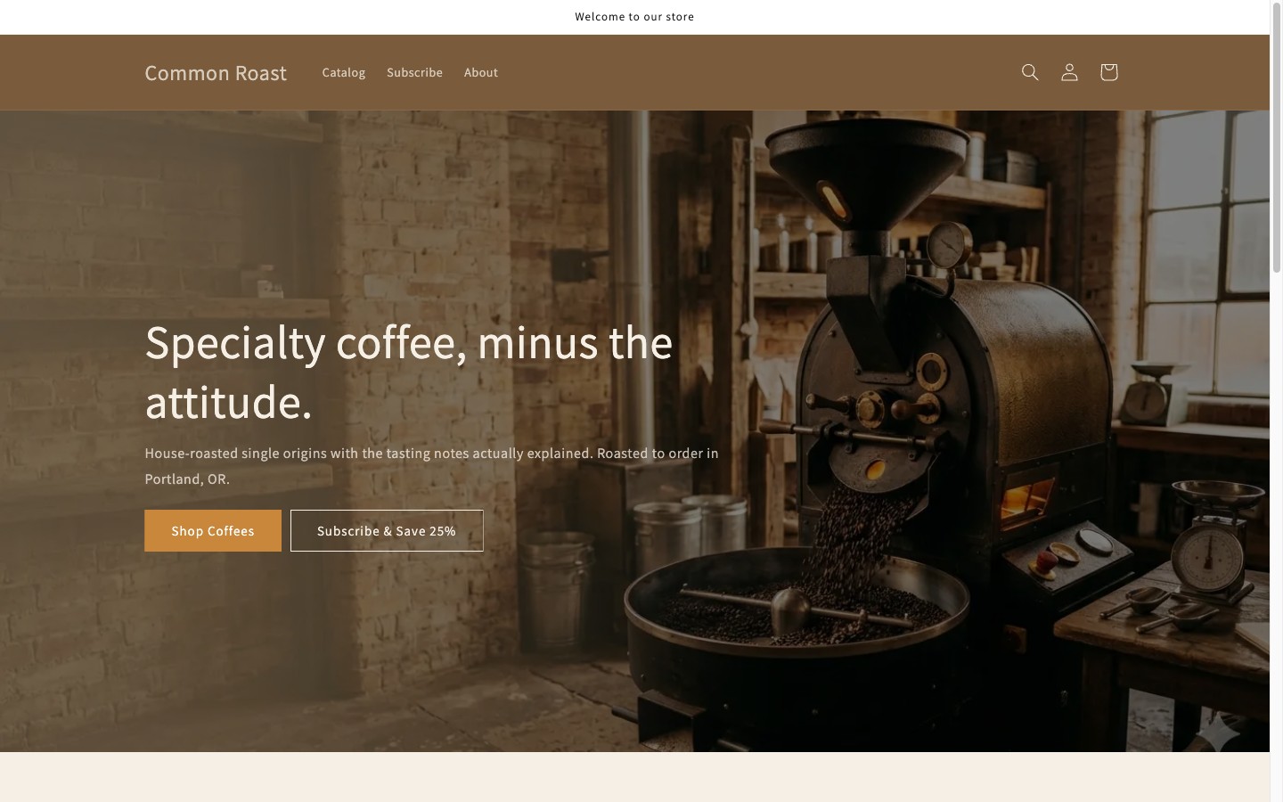
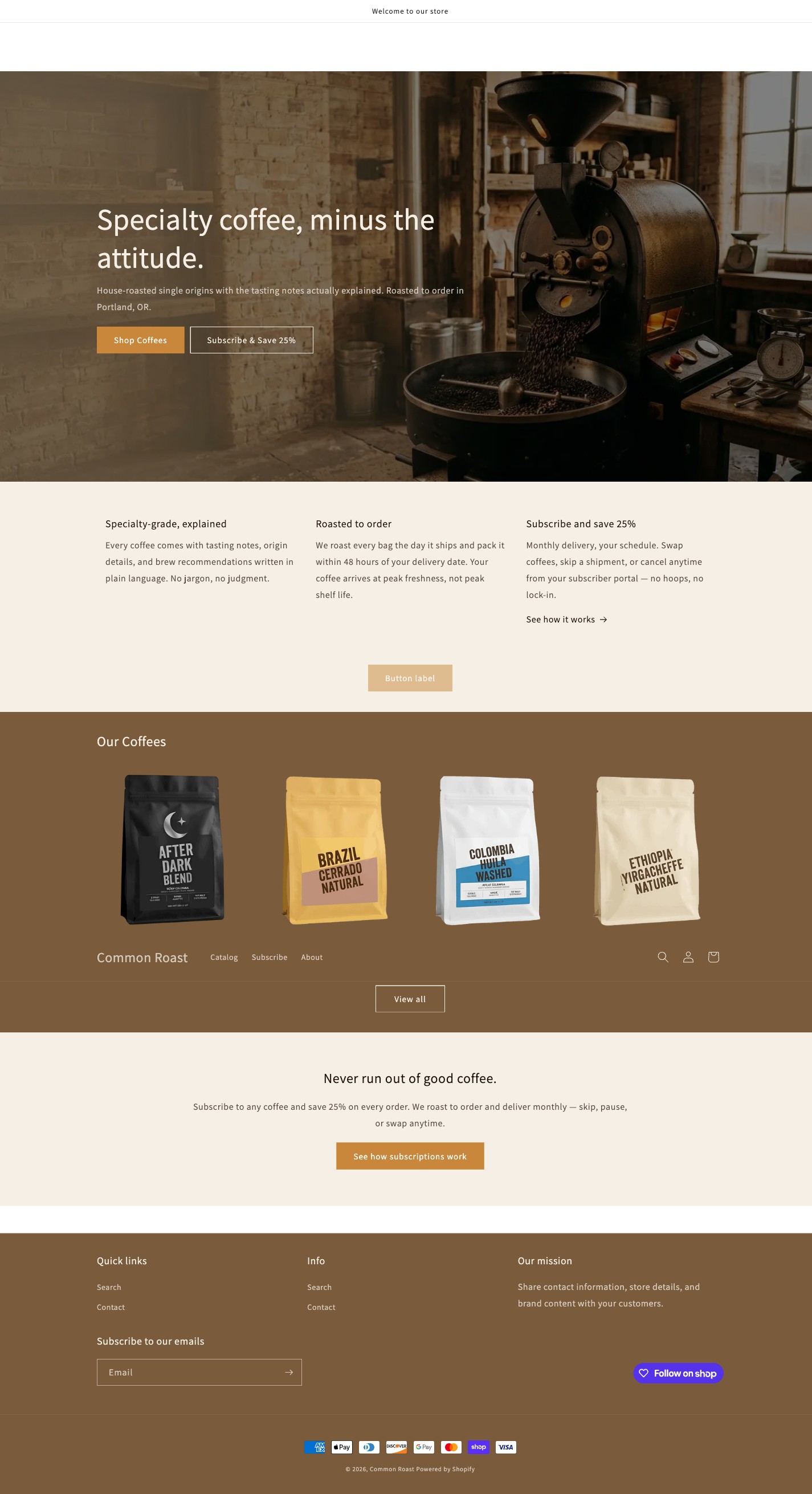
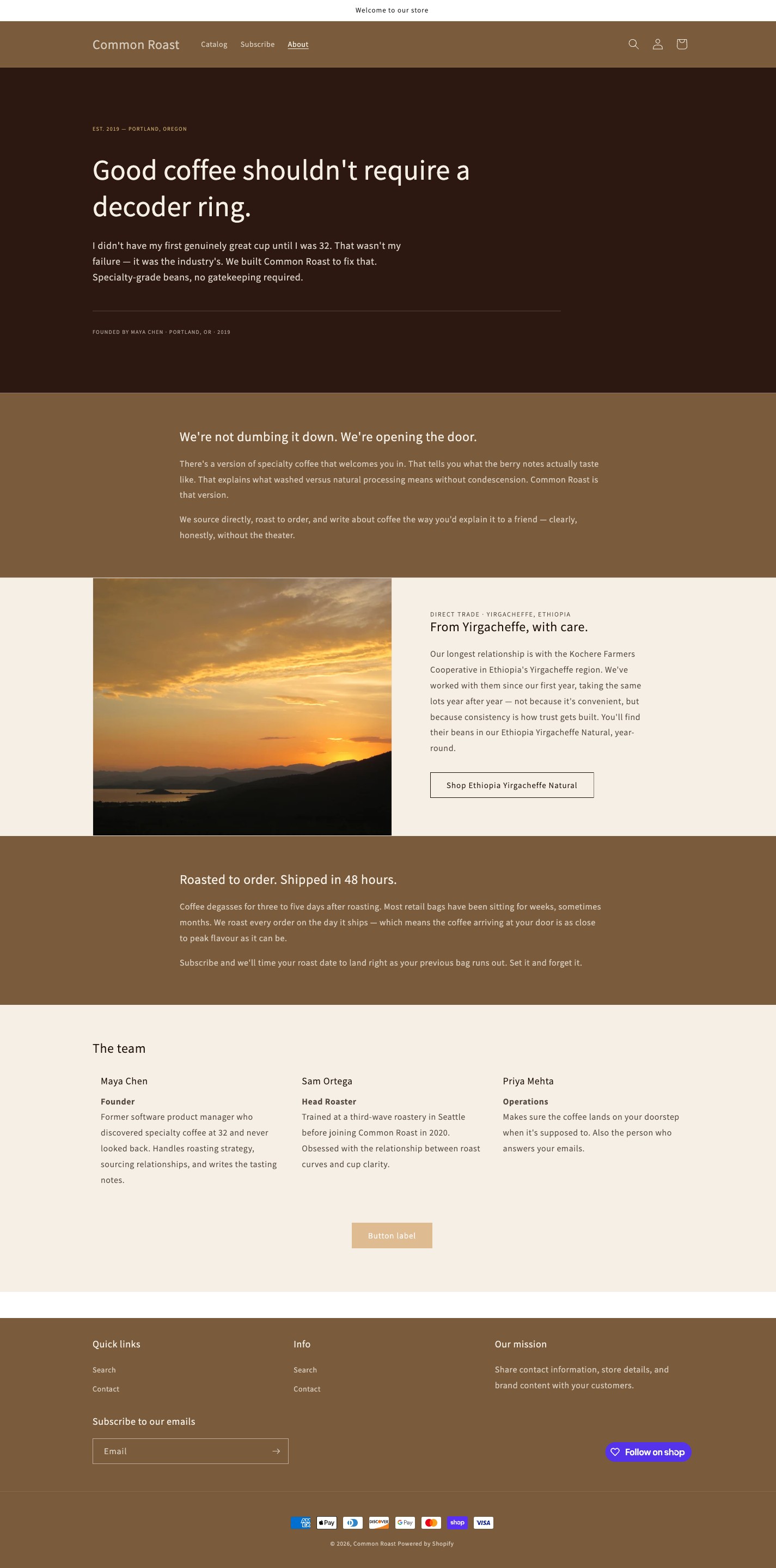
Common Roast is a Shopify portfolio store built to demonstrate deep vertical expertise in the specialty coffee DTC category. The brand is positioned as an “approachable-specialty” roaster — welcoming to newcomers without losing fluency for enthusiasts — and every design decision was made to signal that positioning to prospective mid-market clients.
Design Challenge
The challenge wasn’t designing a generic store — it was designing one that a coffee DTC client would immediately recognise as the work of someone who understands their category. Forking Dawn provides a pragmatic head start, but a store that looks like “Dawn with a coffee logo” defeats the entire purpose. The visible skill signal is how far the final result sits from the defaults: generic equals no signal; unmistakably deliberate equals category expertise.
Visual Decisions
Colour & Typography
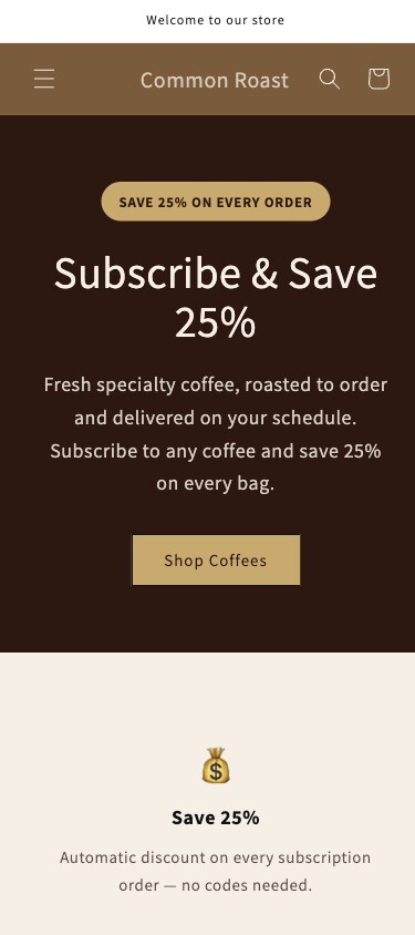
Every visual choice was made in service of the “approachable-specialty” brief: not the ultra-premium dark minimalism of high-end third-wave roasters, and not the mass-market cheerfulness of commodity coffee. The aesthetic sits deliberately in between — warm enough to invite newcomers, considered enough to earn the respect of enthusiasts. The theme’s brand tokens (colour scheme, typography, spacing, and accents) are centralised into four editor settings, so the same store can be reskinned for a new client by updating four values — making the design system itself part of the deliverable.
Layout & Navigation
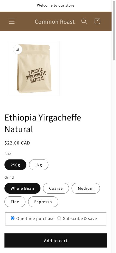
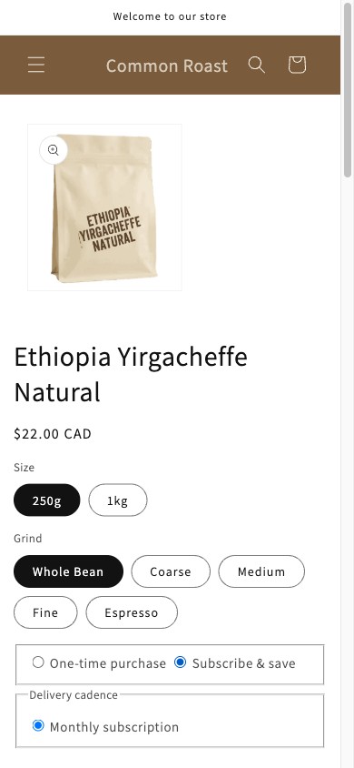
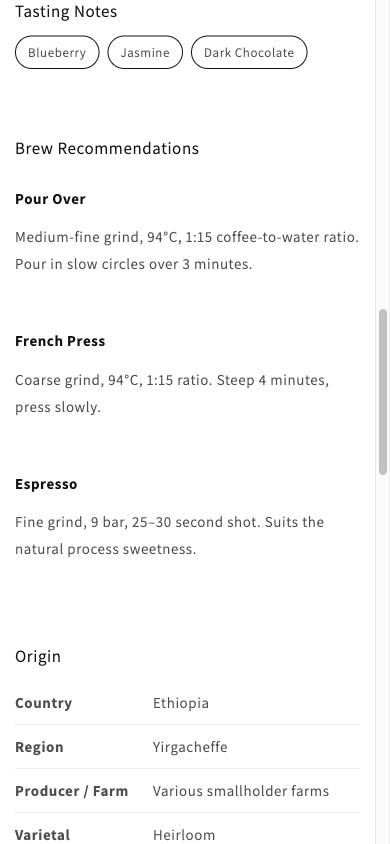
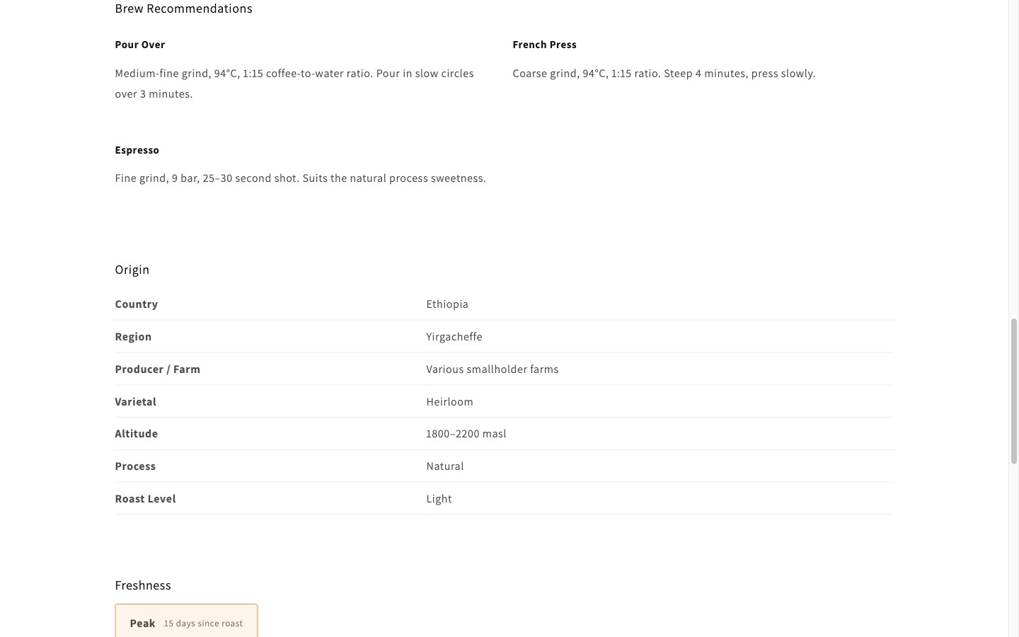
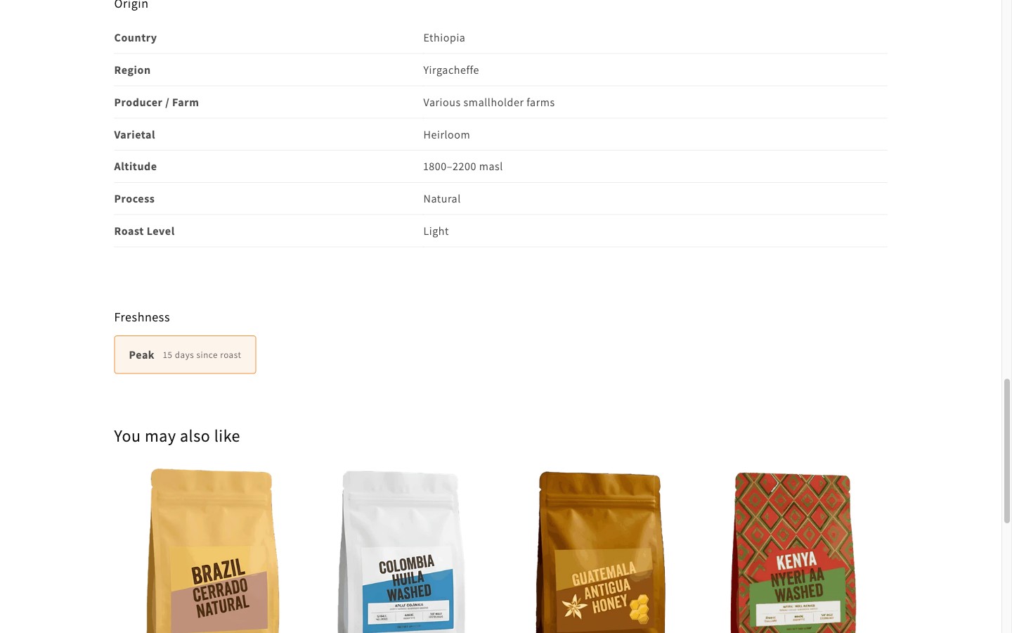
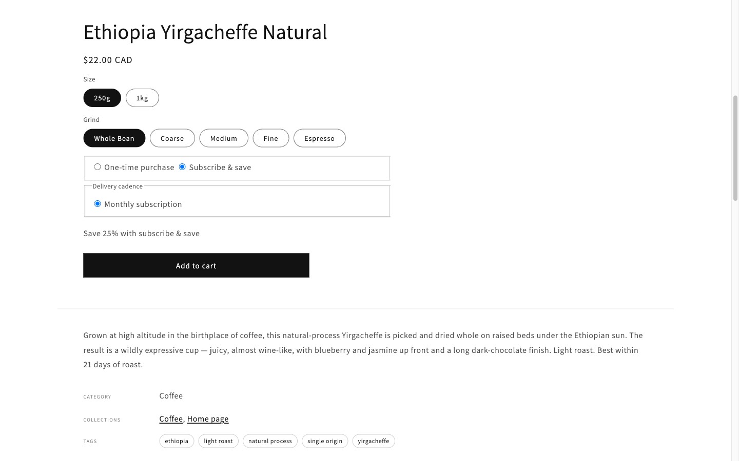
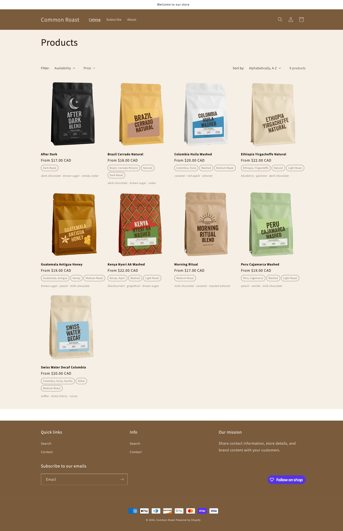
The store extends Dawn’s foundation with coffee-specific sections — tasting notes, brew recommendations, origin story, freshness indicator, and a subscribe & save buy box — each designed to surface the kind of product storytelling that converts first-time buyers in the specialty coffee category. The layout prioritises the product narrative above price, reflecting how DTC coffee brands build loyalty: through transparency and craft, not discounting.
Screenshots