Spirit West United Church
The Brief
Spirit West United Church approached me wanting a complete website redesign. A small community church with dwindling congregation numbers over the past decade, their primary goal was to attract young families — while keeping the site accessible and familiar for their existing elderly members.
Design Challenge
The core challenge was designing for two audiences with fundamentally different needs at the same time. Elderly long-time members needed familiar navigation and a highly accessible interface. Young families needed to feel genuinely welcomed and drawn in — not just accommodated. Getting both right meant finding a design direction warm enough to attract newcomers without alienating the people who had been coming for decades.
Visual Decisions
Colour & Typography
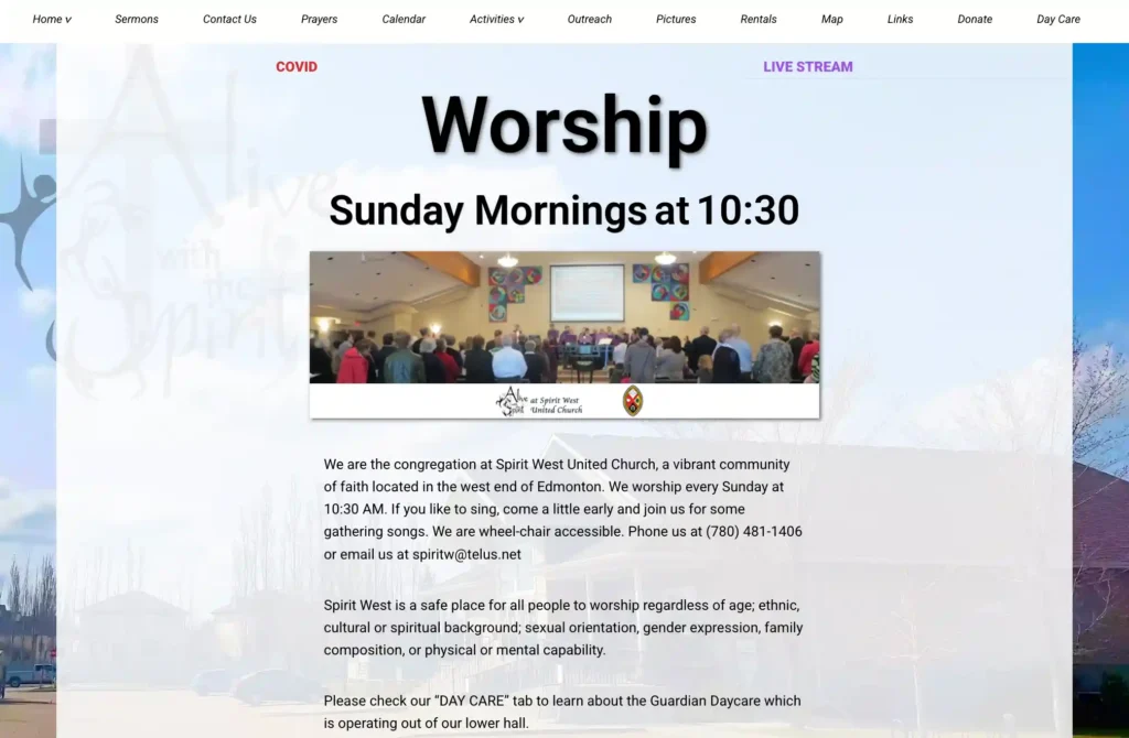
After meeting with the board, I asked what actually kept young families coming back. The answer wasn’t programming or facilities — it was the warmth of intergenerational connection: elderly members sharing stories with children, and the minister delivering a child-friendly version of the Sunday sermon from the stage. That insight became the design theme: a “story time” aesthetic drawn from the visual language of children’s books. A bright, neutral colour palette combined with colourful photography, highly legible typography, and a homepage composed like an inviting book cover. The typefaces prioritise readability above all — supporting both young first-time visitors and older members with varying eyesight.
Layout & Navigation
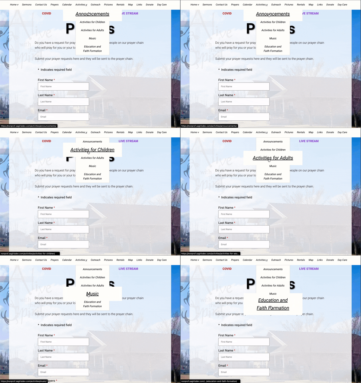
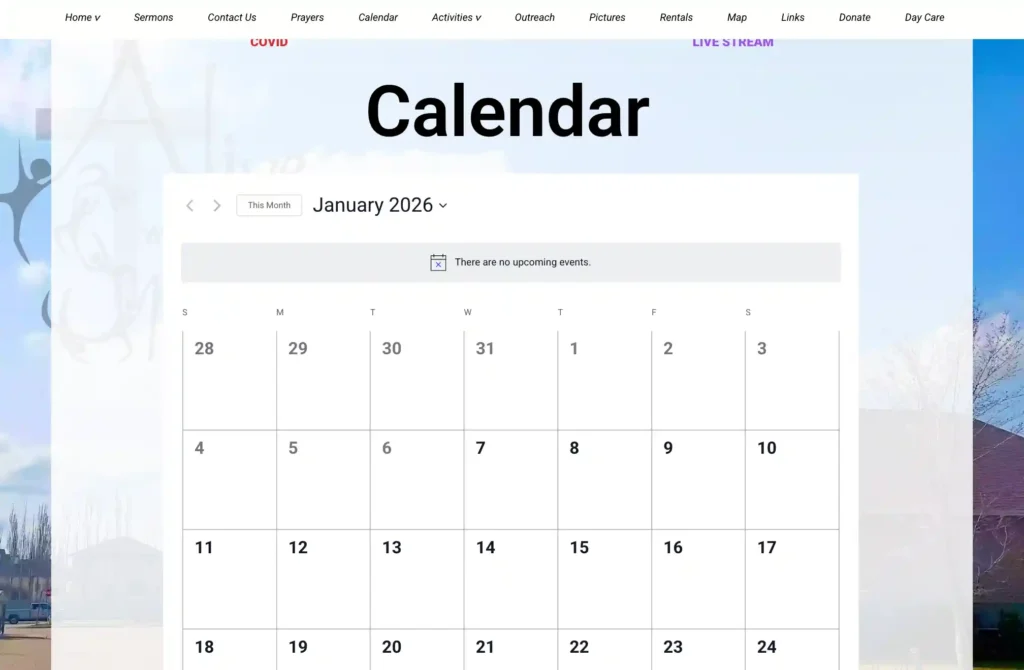
Accessibility shaped every layout decision: interactive elements magnify on hover and keyboard focus, text-to-background contrast is sharp throughout, and form fields are clearly labelled with easy-to-edit inputs. The navigation structure was a deliberate constraint — the board specifically requested that the top-level menu from their previous site be preserved, because existing members didn’t want to relearn how to get around. Rather than treating this as a creative limitation, I used it as an anchor: building a fresh, welcoming visual layer around a familiar skeleton, so the site felt new to visitors while feeling like home to members.
Process — click to view wireflow

Screenshots